CSS Website Layout
A website is often divided into headers, menus, content and a footer: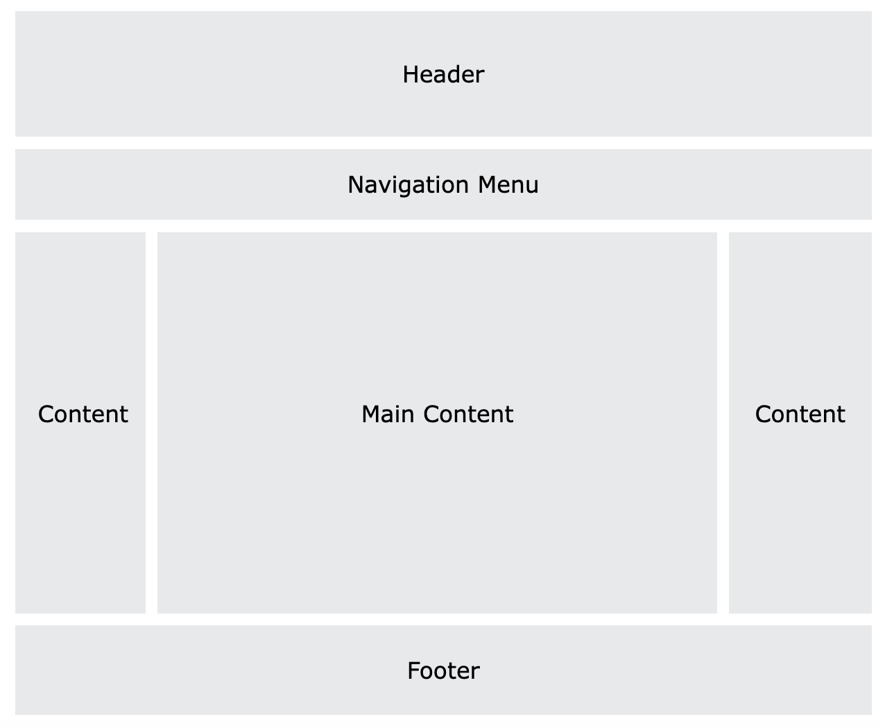
There are countless layout designs available, and this is just one common example.
Header
A header is usually located at the top of the website (or right below a top navigation menu). It often contains a logo or a website name.Example:
		CSS:
		.header {
			background-color: #F1F1F1;
			text-align: center;
			padding: 20px;
		}

		HTML:
		<div class="header">
    			Header
		</div>
Navigation Bar
A navigation bar contains a list of links to help visitors navigate through your website.Example:
		CSS:
		/* The navbar container */
		.topnav {
		  overflow: hidden;
		  background-color: #333;
		}

		/* Navbar links */
		.topnav a {
		  float: left;
		  display: block;
		  color: #f2f2f2;
		  text-align: center;
		  padding: 14px 16px;
		  text-decoration: none;
		}

		/* Links - change color on hover */
		.topnav a:hover {
		  background-color: #ddd;
		  color: black;
		}

		HTML:
		<div class="topnav">
		  <a href="#">Link1</a>
		  <a href="#">Link1</a>
		  <a href="#">Link1</a>
		</div>
Content
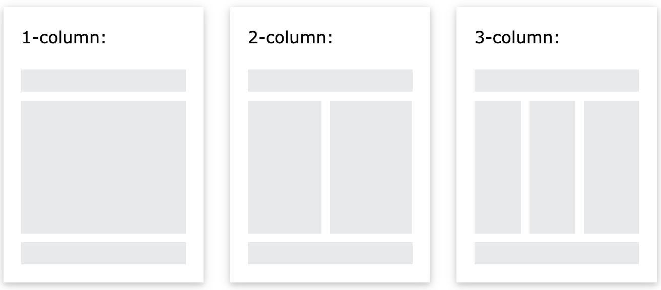
The layout in this section often depends on the target users. The most common layout is one (or combining them) of the following:- 1-column (often used for mobile browsers)
- 2-column (often used for tablets and laptops)
- 3-column layout (only used for desktops)
Example:
		CSS:
		/* Create three equal columns that float next to each other */
		.column {
		  float: left;
		  width: 33.33%;
		}

		/* Clear floats after the columns */
		.row:after {
		  content: "";
		  display: table;
		  clear: both;
		}

		/* Responsive layout - makes the three columns stack on top of each other
		instead of next to each other on smaller screens (600px wide or less) */
		@media screen and (max-width: 600px) {
		  .column {
		    width: 100%;
		  }
		}

		HTML:
		<div class="row">
		    <div class="column">
		       <h1>Column</h1>
		       <p>Lorem ipsum dolor sit amet, consectetur adipiscing elit. Maecenas sit amet pretium urna.
			Vivamus venenatis velit nec neque ultricies, eget elementum magna tristique. Quisque vehicula,
			risus eget aliquam placerat, purus leo tincidunt eros, eget luctus quam orci in velit.
			Praesent scelerisque tortor sed accumsan convallis.</p>
		    </div>

		    <div class="column">
			<h1>Column</h1>
			<p>Lorem ipsum dolor sit amet, consectetur adipiscing elit. Maecenas sit amet pretium urna.
			Vivamus venenatis velit nec neque ultricies, eget elementum magna tristique. Quisque vehicula,
			risus eget aliquam placerat, purus leo tincidunt eros, eget luctus quam orci in velit.
			Praesent scelerisque tortor sed accumsan convallis.</p>
		    </div>
		</div>
Unequal Columns
It is common with unequal column widths so that most of the space is reserved for the main content. The side content (if any) is often used as an alternative navigation or to specify information relevant to the main content. Change the widths as you like, only remember that it should add up to 100% in total.Example:
		CSS:
		.column {
		  float: left;
		}

		/*Class Combination Selector*/
		/* Left and right column */
		.column.side {
		  width: 25%;
		}

		/*Class Combination Selector*/
		/* Middle column */
		.column.middle {
		  width: 50%;
		}

		/* Clear floats after the columns */
		.row:after {
		  content: "";
		  display: table;
		  clear: both;
		}

		/* Responsive layout - makes the three columns stack on top of each other
		   instead of next to each other */
		@media screen and (max-width: 600px) {
		  .column.side, .column.middle {
		    width: 100%;
		  }
		}

		HTML:
		<div class="row">

			  <div class="column side">
			    <h2>Left Side</h2>
			    <p>Lorem ipsum dolor sit amet, consectetur adipiscing elit..</p>
			  </div>

			    <div class="column middle">
			        <h2>Main Content</h2>
			        <p>Lorem ipsum dolor sit amet, consectetur adipiscing elit. Maecenas sit amet pretium urna.
				Vivamus venenatis velit nec neque ultricies, eget elementum magna tristique. Quisque vehicula,
				risus eget aliquam placerat, purus leo tincidunt eros, eget luctus quam orci in velit.
				Praesent scelerisque tortor sed accumsan convallis.</p>
			  </div>

			  <div class="column side">
			        <h2>Right Side</h2>
			        <p>Lorem ipsum dolor sit amet, consectetur adipiscing elit..</p>
			  </div>
		</div>
Footer
The footer is placed at the bottom of your page. It often contains information like copyright and contact info.Example:
		CSS:
		.footer {
		  background-color: #F1F1F1;
		  text-align: center;
		  padding: 10px;
		}

		HTML:
		<div class="footer">
  			<p>Footer</p>
		</div>