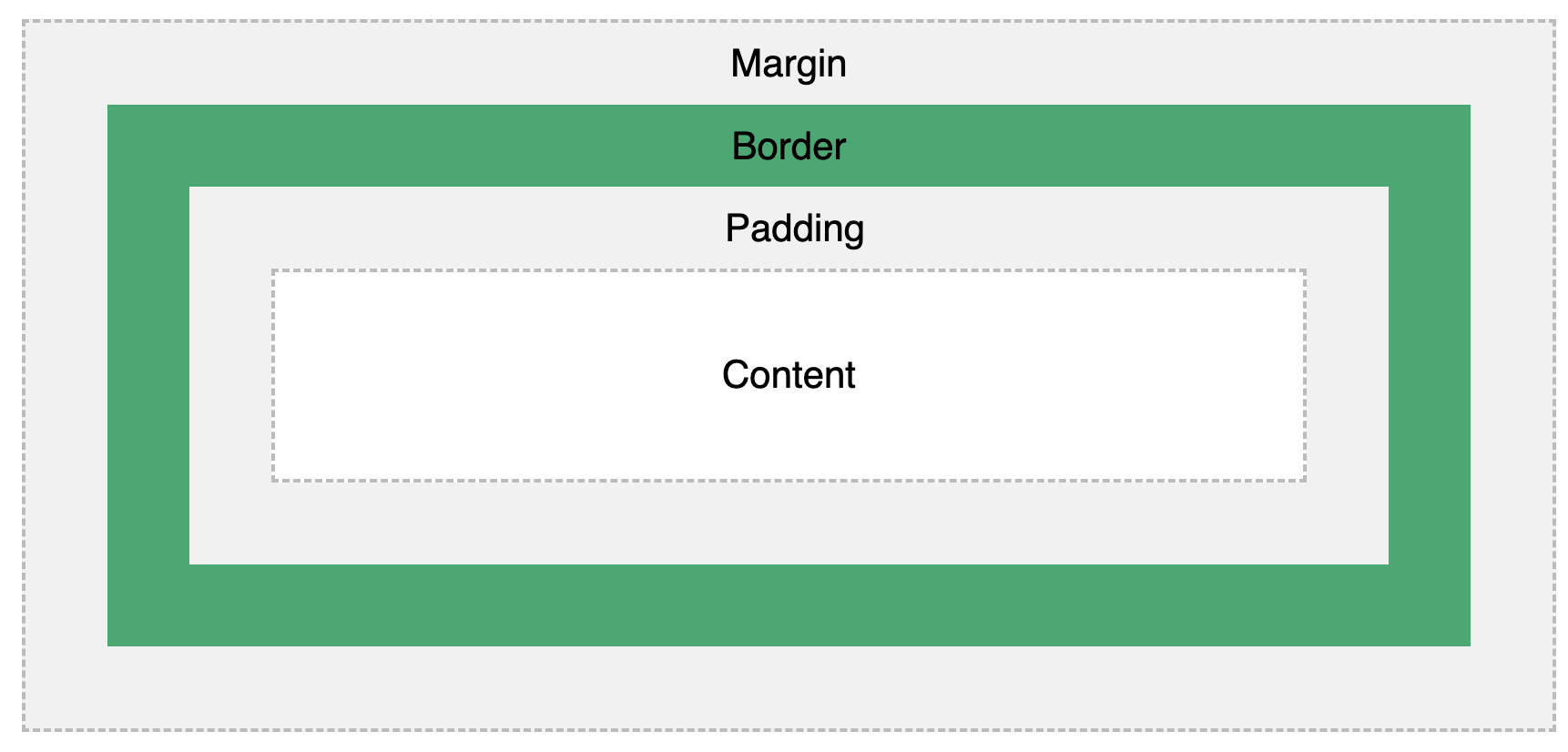
CSS Box Model
- ★ All HTML elements can be considered as boxes.
- ★ In CSS, the term " box model " is used when talking about design and layout.
- ★ The CSS box model is essentially a box that wraps around every HTML element.
- ★ It consists of: margins , borders , padding , and the actual content . The image below illustrates the box model:
- Content - The content of the box, where text and images appear
- Padding - Clears an area around the content. The padding is transparent
- Border - A border that goes around the padding and content
- Margin - Clears an area outside the border. The margin is transparent
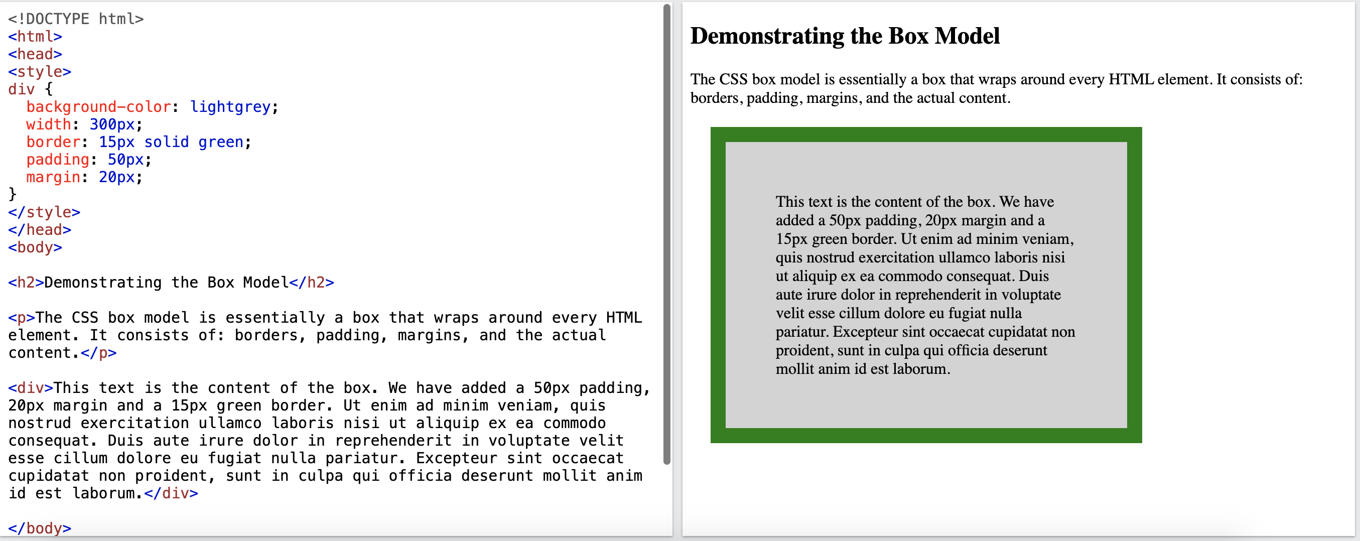
Example
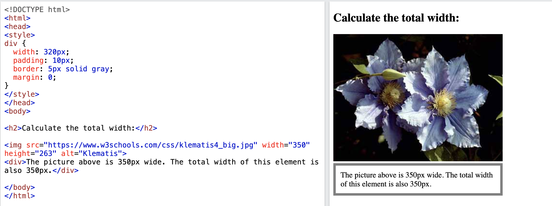
Width and Height of an Element
In order to set the width and height of an element correctly in all browsers, you need to know how the box model works. The following <div> element will have a total width of 350px:
div {
  width: 320px;
  padding: 10px;
  border: 5px solid gray;
  margin: 0;
}
Here is the calculation: 320px (width) + 20px (left + right padding) + 10px (left + right border) + 0px (left + right margin) = 350px Total element width = width + left padding + right padding + left border + right border + left margin + right margin Total element height = height + top padding + bottom padding + top border + bottom border + top margin + bottom margin
Example
CSS Margins
- ★ The margin is the space around the element. The larger the margin, the more space between our element and the elements around it.
- ★ We can adjust the margin to move our HTML elements closer to or farther from each other.
- ★ If set margin to auto, this tells the document to automatically put equal left and right margins on our element, centering it on the page.
- ★ With CSS, you have full control over the margins. There are properties for setting the margin for each side of an element (top, right, bottom, and left).
- ★ CSS has properties for specifying the margin for each side of an element:
- margin-top
- margin-right
- margin-bottom
- margin-left
Example
		div {
		        border: 1px solid black;
  			margin-top: 100px;
  			margin-bottom: 100px;
  			margin-right: 150px;
  			margin-left: 80px;
		}

		<div>This div element has a top margin of 100px, a right margin of 150px,
			a bottom margin of 100px, and a left margin of 80px.</div>
Margin - Shorthand Property
- ★ If the margin property has four values: margin: 25px 50px 75px 100px;
- top margin is 25px
- right margin is 50px
- bottom margin is 75px
- left margin is 100px
- ★ If the margin property has two values: margin: 25px 50px;
- top and bottom margins are 25px
- right and left margins are 50px
- ★ If the margin property has one value: margin: 25px;
- all four margins are 25px
- ★ You can set the margin property to auto to horizontally center the element within its container. margin: auto;
- The element will then take up the specified width, and the remaining space will be split equally between the left and right margins.
CSS Borders
- ★ The border-style property specifies what kind of border to display. Example: https://www.w3schools.com/css/css_border.asp
- ★ The border-width property specifies the width of the four borders. Example: https://www.w3schools.com/css/css_border_width.asp
- ★ The border-color property is used to set the color of the four borders. Example: https://www.w3schools.com/css/css_border_color.asp
			border-width: 2px;
			border-style: dotted;
			border-color: red;

			or

			border: 2px dotted red;
CSS Padding
- ★ The padding is the spacing between your innermost layer: the actual content and the border. We can adjust this value with CSS to move the border closer to or farther from the content.
- ★ The CSS padding properties are used to generate space around an element's content, inside of any defined borders.
- ★ With CSS, you have full control over the padding. There are properties for setting the padding for each side of an element (top, right, bottom, and left).
- ★ CSS has properties for specifying the padding for each side of an element:
- padding-top
- padding-right
- padding-bottom
- padding-left
Example
		div {
		border: 1px solid black;
  		background-color: lightblue;
  		padding-top: 50px;
  		padding-right: 30px;
  		padding-bottom: 50px;
  		padding-left: 80px;
		}

		<div>This div element has a top padding of 50px, a right padding of 30px,
			a bottom padding of 50px, and a left padding of 80px.</div>
Padding - Shorthand Property
- ★ If the padding property has four values: padding: 25px 50px 75px 100px;
- top padding is 25px
- right padding is 50px
- bottom padding is 75px
- left padding is 100px
- ★ If the padding property has two values: padding: 25px 50px;
- top and bottom paddings are 25px
- right and left paddings are 50px
- ★ If the padding property has one value: padding: 25px;
- all four paddings are 25px
CSS Layout - The display Property
- ★ The display property is the most important CSS property for controlling layout.
- ★ The display property specifies if/how an element is displayed.
- ★ Every HTML element has a default display value depending on what type of element it is.
- ★ The default display value for most elements is block or inline
Block-level Elements
A block-level element always starts on a new line and takes up the full width available (stretches out to the left and right as far as it can).Examples of block-level elements:
			<div>
			<h1> - <h6>
			<p>
			<form>
Inline Elements
An inline element does not start on a new line and only takes up as much width as necessary.Examples of inline elements:
			<span>
			<a>
			<img>
Override The Default Display Value
- ★ As mentioned, every element has a default display value. However, you can override this.
- ★ Changing an inline element to a block element, or vice versa, can be useful for making the page look a specific way, and still follow the web standards.
- ★ Four possible values for display property:
- ♣ block : This makes the element a block box. It won’t let anything sit next to it on the page! It takes up the full width.
- ♣ inline-block : This makes the element a block box, but will allow other elements to sit next to it on the same line.
- ♣ inline : This makes the element sit on the same line as another element, but without formatting it like a block. It only takes up as much width as it needs (not the whole line).
- ♣ none : This makes the element and its content disappear from the page entirely!
Example:
- ★ block example:
			CSS:
			span {
        				display: block;
       				        background: lightblue;
    			}

			HTML:
			<span>This is now a block element!</span>
			<span>It will appear on a new line.</span>
- ★ inline example:
			CSS:
			li {
  			display: inline;
			}

			HTML:
			<p>Display a list of links as a horizontal menu:</p>

			<ul>
  			<li><a href="/html/default.asp" target="_blank">HTML</a></li>
  			<li><a href="/css/default.asp" target="_blank">CSS</a></li>
  			<li><a href="/js/default.asp" target="_blank">JavaScript</a></li>
			</ul>
			CSS:
			div{
				border: 1px dashed blue;
				margin: 2px;
				width: 400px;
				height: 50px;
				display: inline-block;
			}

			#div1{
				background-color: red;
			}

			#div2{
				background-color: green;
			}

			#div3{
				background-color: blue;
			}

			HTML:
			<div>Box 1</div>
			<div>Box 2</div>
			<div>Box 3</div>
			CSS:
			p {
        			display: none;
    			}

			HTML:
			<p>This paragraph is hidden!</p>
			<span>This text is visible.</span>
CSS Layout - float and clear
- ★ The CSS float property specifies how an element should float.
- ★ The CSS clear property specifies what elements can float beside the cleared element and on which side.
float
- ★ The float property is used for positioning and formatting content.
- ★ The float property is used to position an element by making it "float" to the left or right of its container.
- ★ It allows text and other elements to wrap around it.
- ★ e.g. let an image float left to the text in a container.
- ★ The float property can have one of the following values:
- left - The element floats to the left of its container
- right - The element floats to the right of its container
- none - The element does not float (will be displayed just where it occurs in the text). This is default
- inherit - The element inherits the float value of its parent. If the parent does not have float set, inherit will do nothing because the default float value is none.
- ★ Example: https://www.w3schools.com/css/css_float.asp
			/*In CSS file*/
			img {
  			float: right;
			}

			/*In HTML file */
			<p>In this example, the image will float to the right in the paragraph,
			and the text in the paragraph will wrap around the image.</p>

			<p><img src="https://www.w3schools.com/css/pineapple.jpg"
			alt="Pineapple" style="width:170px;height:170px;margin-left:15px;">
			Lorem ipsum dolor sit amet, consectetur adipiscing elit. Phasellus imperdiet,
			nulla et dictum interdum, nisi lorem egestas odio, vitae scelerisque enim
			ligula venenatis dolor. Maecenas nisl est, ultrices neccongue eget, auctor
			vitae massa. Fusce luctus vestibulum augue ut aliquet. Mauris ante ligula,
			facilisis sed ornare eu, lobortis in odio. Praesent convallis urna a lacus
			interdum ut hendrerit risus congue. Nunc sagittis dictum nisi, sed ullamcorper
			ipsum dignissim ac. In at libero sed nunc venenatis imperdiet sed ornare turpis.
			Donec vitae dui eget tellus gravida venenatis. Integer fringilla congue eros non
			fermentum. Sed dapibus pulvinar nibh tempor porta. Cras ac leo purus. Mauris quis
			diam velit.</p>
clear
The clear property is used to stop elements from wrapping around a floated element. When we use the float property, and we want the next element below (not on right or left), we will have to use the clear property.- ★ The clear property specifies what should happen with the element that is next to a floating element.
- ★ Elements after a floating element will flow around it. To avoid this, use the clear property. .
- ★ The clear property specifies on which sides of an element floating elements are not allowed to float.
- ★ The clear property can have one of the following values:
- none - The element is not pushed below left or right floated elements. This is default
- left - The element is pushed below left floated elements
- right - The element is pushed below right floated elements
- both - The element is pushed below both left and right floated elements
- inherit - The element inherits the clear value from its parent
- ★ When clearing floats, you should match the clear to the float: If an element is floated to the left, then you should clear to the left. Your floated element will continue to float, but the cleared element will appear below it on the web page.
- ★ Example: https://www.w3schools.com/css/tryit.asp?filename=trycss_layout_clear
			div1 {
  				float: left;
			}

			div2 {
  				clear: left;
			}
CSS Layout - The position Property
- ★ The position property specifies the type of positioning method used for an element.
- ★ The CSS position property determines how an element is positioned within a document.
- ★ It works in conjunction with the top, right, bottom, and left properties to define the exact placement of an element.
- ★ There are four different position values:
- ♣ static
- ☆ HTML elements are positioned static by default.
- ☆ Static positioned elements are not affected by the top, bottom, left, and right properties.
- ☆ An element with position: static; is not positioned in any special way; it is always positioned according to the normal flow of the page.
- ♣ relative
- ☆ An element with position: relative; is positioned relative to its normal position.
- ☆ Setting the top, right, bottom, and left properties of a relatively-positioned element will cause it to be adjusted away from its normal position, but the space it originally occupied remains.
					.relative {
  						position: relative;
  				  		left: 30px;
  						border: 3px solid #73AD21;
					}
- ☆ An element with position: fixed; is positioned relative to the viewport, which means it always stays in the same place even if the page is scrolled.
- ☆ The top, right, bottom, and left properties are used to position the element.
					.fixed {
  						position: fixed;
  						bottom: 0;
  						right: 0;
  						width: 300px;
  						border: 3px solid #73AD21;
					}
- ☆ An element with position: absolute; is positioned relative to the nearest positioned ancestor.
- ☆ However; if an absolute positioned element has no positioned ancestors, it uses the document body (usually the <html> element), and moves along with page scrolling.
- ☆ Example: https://www.w3schools.com/css/tryit.asp?filename=trycss_position_absolute
CSS Navigation Bar
- ★ Having easy-to-use navigation is important for any web site.
- ★ With CSS you can transform boring HTML menus into good-looking navigation bars.
- ★ Navigation Bar = List of Links
- ★ A navigation bar is basically a list of links, so using the <ul> and <li> elements makes
perfect sense:
			<ul>
			<li><a href="https://xinyangmtsu.github.io/" target="_blank">Home</a></li>
			<li><a href="https://xinyangmtsu.github.io/3080.html" target="_blank">CSCI 3080</a></li>
			<li><a href="https://xinyangmtsu.github.io/4410.html" target=""_blank>CSCI 4410</a></li>
			</ul>
- ★ Remove the bullets and the margins and padding from the list
				ul {
  				list-style-type: none;
  				margin: 0;
  				padding: 0;
				}
				ul {
  				list-style-type: none;
  				margin: 0;
  				padding: 0;
  				width: 200px;
  				background-color: #f1f1f1;
				}

				li a {
  				display: block;
  				color: #000;
  				padding: 8px 16px;
  				text-decoration: none;
				}

			/* Change the link color on hover */
				li a:hover {
  				background-color: #555;
  				color: white;
				}
- ♣ One way to build a horizontal navigation bar is to specify the <li> elements as inline,
					ul {
  					list-style-type: none;
  					margin: 0;
  					padding: 0;
					}

					li {
  					display: inline;
					}
				ul {
					list-style-type: none;
					margin: 0;
					padding: 0;
					overflow: hidden; /* Prevents content from overflowing */
					background-color: #333;
				}

				li {
					 float: left;
				}

				li a {
					display: block;
					color: white;
					text-align: center;
					padding: 14px 16px;
					text-decoration: none;
         			}

       				li a:hover {
					background-color: #111;
        			}
When child elements (in this case, <li> elements) are floated, their parent container (<ul>) may collapse in height because floated elements are removed from the normal document flow. This can lead to visual issues, such as the parent not enclosing its children properly, affecting background colors, borders, and overall layout.
By setting overflow: hidden; on the <ul>, you're creating a new block formatting context, which forces the parent to recognize the height of its floated children and expand accordingly. This technique ensures that the <ul> encompasses all its <li> elements, maintaining the intended design and layout.
				ul {
  					position: fixed;
 					top: 0;
  					width: 100%;
				}
CSS Dropdown Navbar
Create a Dropdown Menu inside a Navigation Bar.
		CSS:
		ul {
			  list-style-type: none;
			  margin: 0;
			  padding: 0;
			  overflow: hidden; /* Prevents content from overflowing */
			  background-color: #333;
		}

		li {
		  float: left; /* Aligns list items horizontally */
		}

		li a, .dropbtn {
		  display: inline-block;
		  color: white;
		  text-align: center;
		  padding: 14px 16px;
		  text-decoration: none;
		}

		li a:hover, .dropdown:hover .dropbtn {
		  background-color: red;
		}

		li.dropdown {
		  display: inline-block;
		}

		.dropdown-content {
		  display: none; /* Hides dropdown content initially */
		  position: absolute; /* Positions dropdown content below the button */
		  background-color: #f9f9f9;
		  min-width: 160px;
		  box-shadow: 0px 8px 16px 0px rgba(0,0,0,0.2);
		  z-index: 1; /* Ensures dropdown appears above other elements */
		}

		.dropdown-content a {
		  color: black;
		  padding: 12px 16px;
		  text-decoration: none;
		  display: block;
		  text-align: left;
		}

		.dropdown-content a:hover {background-color: #f1f1f1;}

		.dropdown:hover .dropdown-content {
		  display: block;
		}

		HTML:
		<ul>
			  <li><a href="#home">Home</a></li>
			  <li><a href="#news">News</a></li>
			  <li class="dropdown">
				    <a href="javascript:void(0)" class="dropbtn">Dropdown</a>
				    <div class="dropdown-content">
				      <a href="#">Link 1</a>
				      <a href="#">Link 2</a>
				      <a href="#">Link 3</a>
				    </div>
			  </li>
		</ul>
		<!--javascript:void(0) is commonly used to prevent a link from navigating
			to another page or refreshing the page when clicked. -->